There is a code (file tablet.css)
body {
    margin: 0;
    padding: 0;
}

.globalcontainer {
    margin-top: 0px;
    margin-right: (calc(39/768*100)%);
    margin-bottom: 0px;
    margin-left: (calc(39/768*100)%);
    /*height: 100%;*/
}

.header > .header__text {
position: relative;
width: 93px;
height: 24px;
left: 0;
margin-top: 129px;
margin-bottom: 20px;

font-family: TT Norms;
font-style: normal;
font-weight: bold;
font-size: 24px;
line-height: 100%;
/* identical to box height, or 24px */


color: #000000;
}

/*
.header__buttons {
    left: 0;
    top: 193px;
}
*/


.header__button {
    width: 75px;
    height: 30px;
    border-radius: 4px;
    border-color: #5f3ec0;
    background-color: #fff;
    margin-right: 1.75%;
    display: flex;
    justify-content: center;
    align-items: center;
    white-space: nowrap;
}

.header__buttons {
    display: flex;
    flex-direction: row;
    align-items: center;
    padding: 7px 15px 7px 0px;
    overflow: hidden;
    /*margin-right: 10%;*/
}
<html>
<head>
<!-- <link rel="stylesheet" href="testsite.css">-->
<meta http-equiv="Content-Type" content="text/html; charset=UTF-8">
<meta name="viewport" content="width=device-width, initial-scale=1.0">
<title>Test Example</title>
<link rel="stylesheet" type="text/css" href="../css/mobile.css" media="screen and (min-width: 320px) and (max-width: 639px)"></link>
<link rel="stylesheet" type="text/css" href="../css/tablet.css" media="screen and (min-width: 640px) and (max-width: 1023px)"></link>
<link rel="stylesheet" type="text/css" href="../css/desktop.css" media="screen and (min-width: 1024px) and (max-width: 1920px)"></link>
<script type="text/javascript" src="http://code.jquery.com/jquery-3.6.0.min.js"></script>
</head>
<body>
<div class="container">
<div class="globalcontainer">
<div class="header">
<div class="header__text">
Обзоры
</div>
<div class="header__buttons">
<!-- <span> -->
<button class="header__button">Все</button>
<button class="header__button">Видео</button>
<button class="header__button">Текст</button>
<button class="header__button">Обзоры</button>
<button class="header__button">Сравнения</button>
<button class="header__button">Краш видео</button>
<button class="header__button">Распаковка</button>
<!-- </span> -->
</div>
</div>
</div>
</div>
<script type="text/javascript" src="jsactions.js"></script>
</body>
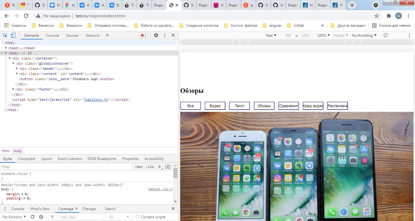
</html> And it is displayed as in the screenshot below
Where is the padding margin-left: (calc (39/768 * 100))%;? (fillerfillerfillerfillerfillerfillerfillerfillerfillerfillerfillerfillerfillerfillerfillerfillerfillerfillerfillerfillerfillerfillerfillerfillerfillerfillerfillerfillerfillerfillerfillerfillerfillerfillerfillerfillerfillerfillerfillerfillerfillerfillerfillerfillerfillerfillerfillerfillervfillerfillerfillerfillervvfillerfillerfillerfillerv)
Aucun commentaire:
Enregistrer un commentaire