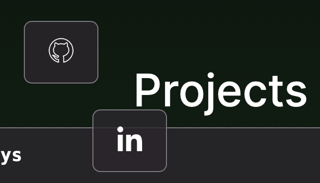
I am trying to align two boxes next to each other like the following. This works as shown below until you shrink the screen size. Then the items get jumbled up as shown in the second picture.

The code I am using is the following:
CSS
#leftbox {
  margin-top: 30px;
  margin-bottom: 30px;
  margin-right: 10px;
  margin-left: 35%;
  float:left;
}

#rightbox {
  margin-top: 30px;
  margin-bottom: 30px;
  margin-right: 35%;
  margin-left: 10px;
  float:right;
}
HTML
<div id = "leftbox">
        <a target="_blank" href="link" style="text-decoration: none">
          <code>
           <img src="github.png" height="25" width="25"/>
          </code>
        </a>
      </div>
      <div id = "rightbox">
        <a target="_blank" href="link" style="text-decoration: none">
          <code>
           <img src="linkedin.png" height="25" width="25"/>
          </code>
        </a>
      </div>
How can I fix this?
Aucun commentaire:
Enregistrer un commentaire