I'm trying to make a responsive navbar. It is working fine in large windows but when I put it in a xs screen it is not collapsing well the fist element of the nabar. I put an exemple of the two cases:
First case, it's working fine: 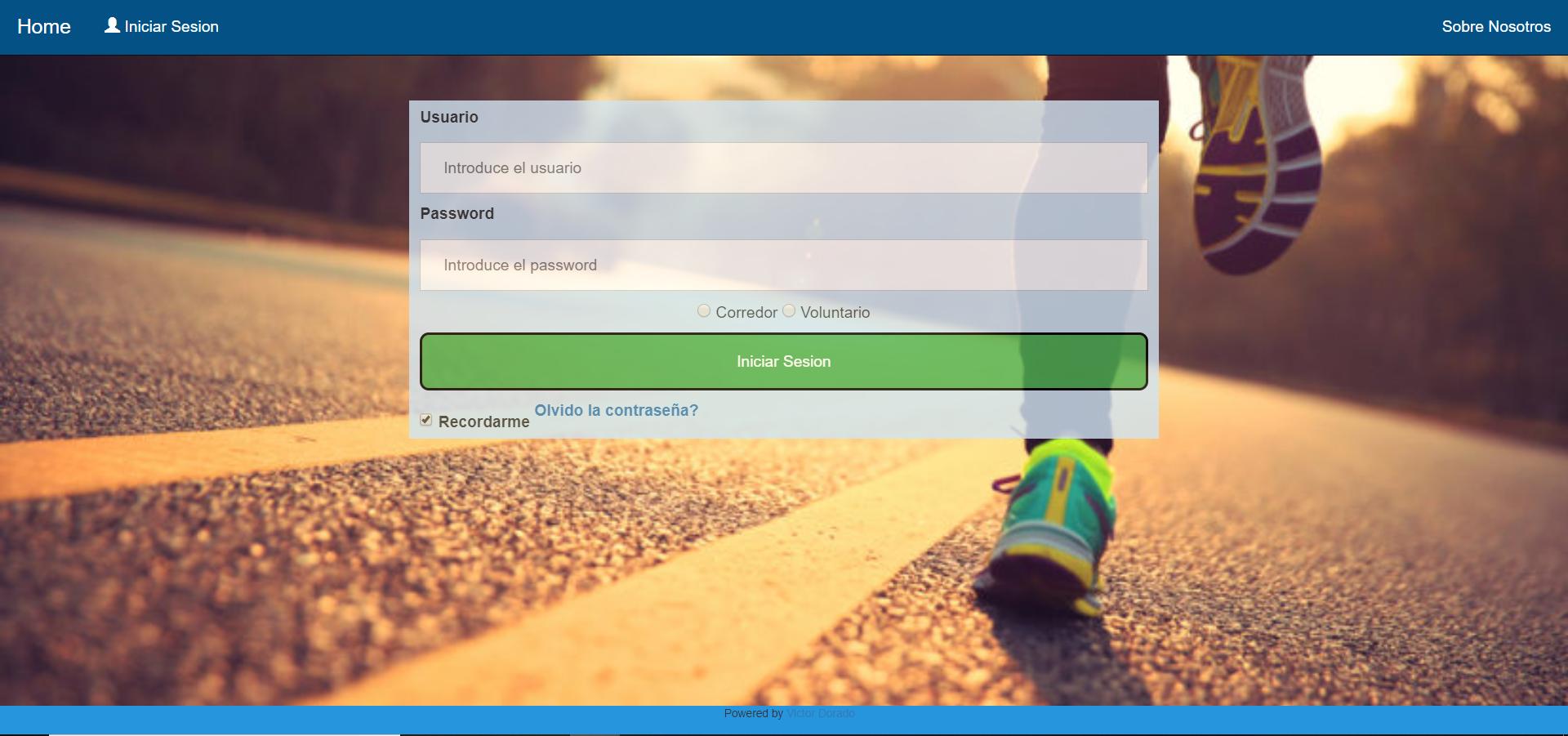
And this is the second case: 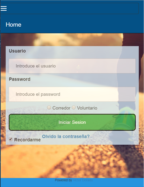
Why is the "HOME" Not colapsing?
I attach the code of the html and the css code:
HTML:
<!DOCTYPE html>
<html >
<title>Login</title>
<head>
<meta name="viewport" content="width=device-width, initial-scale=1", charset="UTF-8">

  <script src="https://ajax.googleapis.com/ajax/libs/jquery/3.4.0/jquery.min.js"></script>

  <script src="http://ajax.googleapis.com/ajax/libs/jquery/1.7.1/jquery.min.js" type="text/javascript"></script>
  <script src="https://cdnjs.cloudflare.com/ajax/libs/popper.js/1.14.7/umd/popper.min.js"></script>
  <link rel="stylesheet" href="https://maxcdn.bootstrapcdn.com/bootstrap/3.4.0/css/bootstrap.min.css">
  <script src="https://maxcdn.bootstrapcdn.com/bootstrap/3.4.0/js/bootstrap.min.js"></script>

<link rel="stylesheet" type="text/css" href="css/Login.css">
</head>
<body>

  <nav class="navbar navbar-inverse navbar-static-top" style="background-color: #045186;">
    <div class="container-fluid">
      <div class="navbar-header">
        <button type="button" class="navbar-toggle" data-toggle="collapse" data-target="#myNavbar2">
          <span class="icon-bar"></span>
          <span class="icon-bar"></span>
          <span class="icon-bar"></span>
        </button>
        <a class="navbar-brand" style="color: white" href="#">Home</a>
      </div>
      <div class="collapse navbar-collapse" id="myNavbar2">
        <ul class="nav navbar-nav">
          <li><a style="color: white" href="Login.html"><span class="glyphicon glyphicon-user"style="color: white"></span> Iniciar Sesion</a></li>
        </ul>
        <ul class="nav navbar-nav navbar-right">
          <li><a style="color: white" href="#">Sobre Nosotros</a></li>
        </ul>
      </div>
    </div>
  </nav>
<br>


<div class="container-fluid " style="background:none">
  <div class="row">

      <div class="col-xs-12 col-md-6 col-md-offset-3"><!-- El offset es para centrar la columna en el medio de la pantalla-->
          <div class="blue-column">
            <label for="uname"><b>Usuario</b></label>
            <input type="text" placeholder="Introduce el usuario" name="uname" id="uname" >

            <label for="psw"><b>Password</b></label>
            <input type="password" placeholder="Introduce el password" name="psw" id="psw">
            <div class="center-block text-center">
              <input type="radio" name="tipousuario" value="corredor" id="tipousuario"> Corredor
              <input type="radio" name="tipousuario" value="voluntario" id="tipousuario"> Voluntario<br>
            </div>
            <button id="login" value="Login" onclick="post();">Iniciar Sesion</button>
            <label>
              <input type="checkbox" checked="checked" name="Recordarme"> Recordarme
            </label>
            <label>
              <span class="psw"><a href="#">Olvido la contraseña?</a></span>
            </label>
      </div>
    </div>
  </div>
</div>
<br><br><br><br><br><br><br><br><br><br>


  <footer class="piedepagina">
      <i class="fa fa-facebook-official w3-hover-opacity"></i><i class="fa fa-instagram w3-hover-opacity"> </i><i class="fa fa-twitter w3-hover-opacity"> </i><i class="fa fa-linkedin w3-hover-opacity"></i>
      <p class="piedepaginaInside">Powered by <a href="https://www.linkedin.com/in/victor-dorado-fern%C3%A1ndez-03b842105/" target="_blank">Victor Dorado</a></p>
    </footer>

</body>
An here the css code:
html {
    background: url(Fondo.jpg) no-repeat center center fixed;  /*Poner foto de fondo. */
    background-size:cover;                                     /*Para que la foto ocupe toda la pantalla*/
    overflow-y:auto;                                           /*Para que salga scroollbar cuando se hace zoom*/
    /*overflow-x:auto;*/
    font-family: Arial, Helvetica, sans-serif;                 /*Tipo de letra en todo el documento*/
    }

body{
  background:none !important;
  margin: 0 !important;         /*Estas dos lineas son para que la navbar este pegada arriba*/
  padding: 0 !important;
}

h2{
    color:#4CAF50;
}

label{
    font-weight:bold;
}


input[type=text], input[type=password] {
    width: 100%;
    padding: 12px 20px;
    margin: 8px 0;
    display: inline-block;
    border: 1px solid #ccc;
    box-sizing: border-box;
  }

  button {
    background-color: #4CAF50;
    color: white;
    padding: 14px 20px;
    margin: 8px 0;
    border: 2px solid rgb(0, 0, 0);
    cursor: pointer;
    width: 100%;
    border-radius: 8px;
  }

  button:hover {                                /* Que sucede cuando se coloca raton encima de boton */
    opacity: 0.8;
  }


  span.psw {
    float: right;
    /*padding-top: 16px;*/
  }

  .blue-column {
    background-color: #D1E4F2;
    opacity: 0.8;
    margin-left: auto;
    margin-right: auto;
    display:block;
    padding-top: 5px;/**Para que el titutlo este un poco separado del margen azul de arriba*/
    padding-left: 10px;
  padding-right: 10px;

  }

  .piedepagina{
    position:fixed;
    left:0px;
    bottom:0px;
    height:27px;
    width:100%;
    background-color: #2794DE;
    text-align: center;
    float: right;
    font-size: 10px;

  }
  .piedepaginaInside{
    display: inline-block;
    margin-left: 10px;

  }


.navbar li a {
  color: #ffff;
}
Thanks in advance for the help!!
Aucun commentaire:
Enregistrer un commentaire